Design Principles Lab
Design Principles Lab
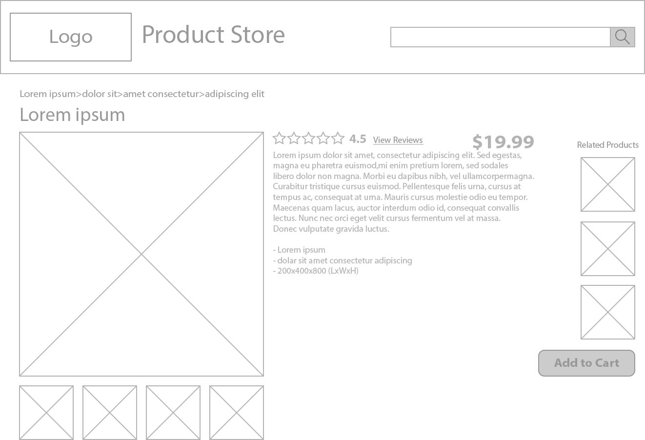
My research was based on websites such as Amazon, TradeMe, Mitre10, AliExpress and PrimeDriven. A few things I noticed that was similar about all these websites were:
- Website logo at top-left
- Large Image of product, aligned to the left
- Mostly white with small accents of colour
- Price normally to the right, in a large font-size
- shipping options under price
- extra images to the left or under present large image
- alignment of images to information box
- Search button to the right of the search bar
- Search button in a contrasting colour to banner colour
- Location of Item in catergories under banner
In my design, I made it so all important info was easy to see, such as the Product Name, Images, Reviews and Price. The “Add To Cart” button has been placed at the bottom-right as people will normally read left-to-right, top-to-bottom, so the add to cart option is visible after all the information about the product.