Assignment 1 UI Design
IN614 User Interface Design
Inspiration
I got my inspiration for the design from multiple different apps I found on my phone, such as:
- The Reddit App for Menu and Layout inspiration, which I applied to the buttons on the bottom of the app, and the Creator Information page.
- Facebook Messenger for the layout of the Course Information. I however ended up basing my design on the design we already had on the website itself but changing it to fit in better with the rest of the mobile app design.
- ANZ GoMoney App for design of the menu and some of the layout. I however ended up not using much inspiration from this.
- Google Chrome for Icon inspiration, which is where I based the Menu and Home Icons on the bottom of the screen.
- Slack for some of the menu inspiration.
- Spark Mobile for the menu inspiration. I ended up using this app for the menu inspiration the most, compared to the other applications I had looked at.
Application Choice
For the program, I used Illustrator, and despite having less experience in the program compared to Photoshop, I felt like it would be the better choice as the program was built more for designing icons, applications, etc. It also had the smart guides for any object, which made it easier to get alignment correct for my design. Because of my lack of experience with Illustrator, I felt that this assignment would be a good way of learning the program more, and to test my skills with it, compared to a program such as Photoshop where I already understand how the program works (although there is still plenty to learn with Photoshop still.)
Design Choices
For some of the icons, I designed them based on other designs I had found on the apps listed above, as well as ones I had seen on google. I found most of my inspiration by googling the item I wanted for and adding icon at the end. I then used what I found as inspiration but adjusted the icons to fit in more with the design of the other icons.
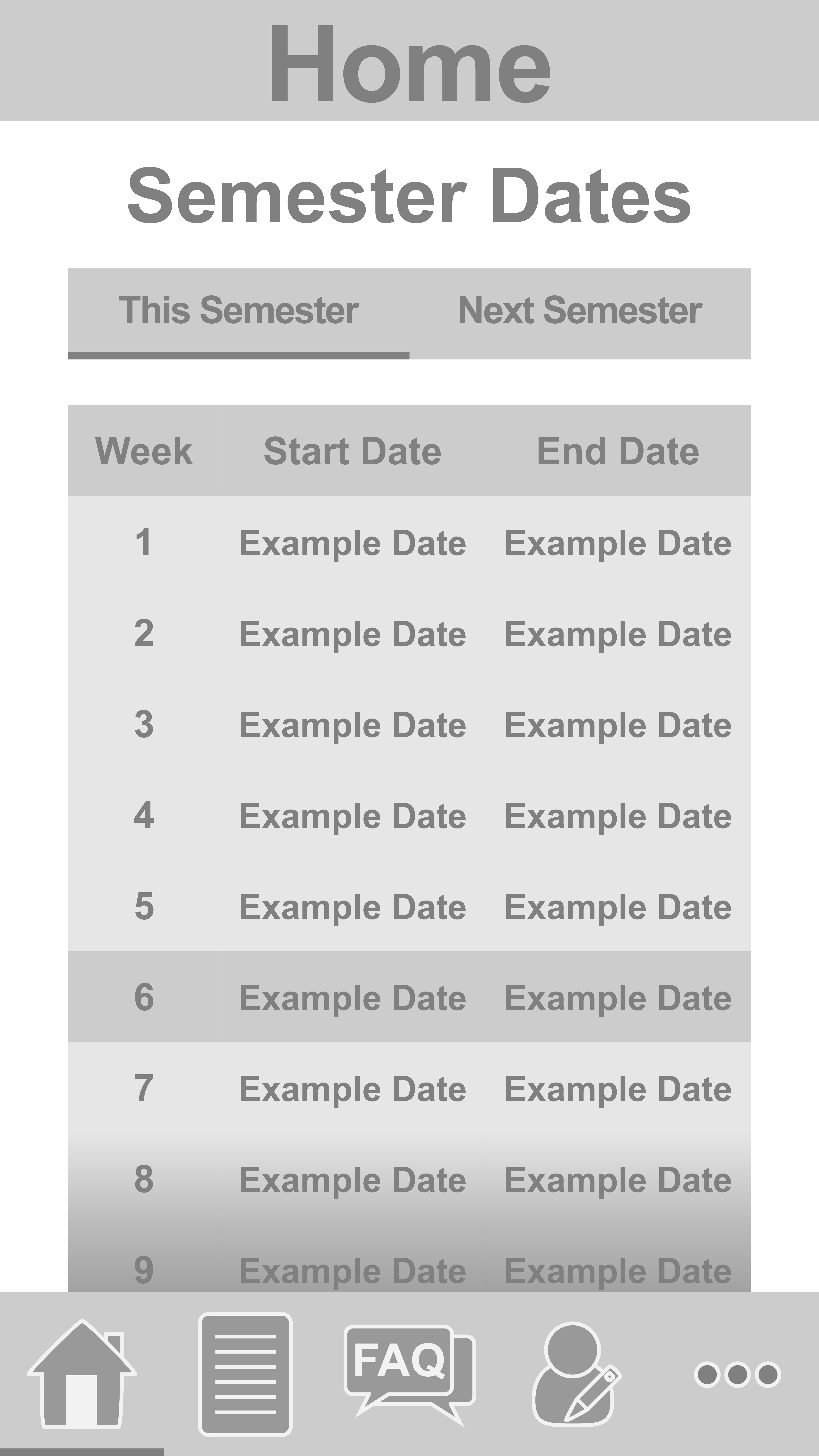
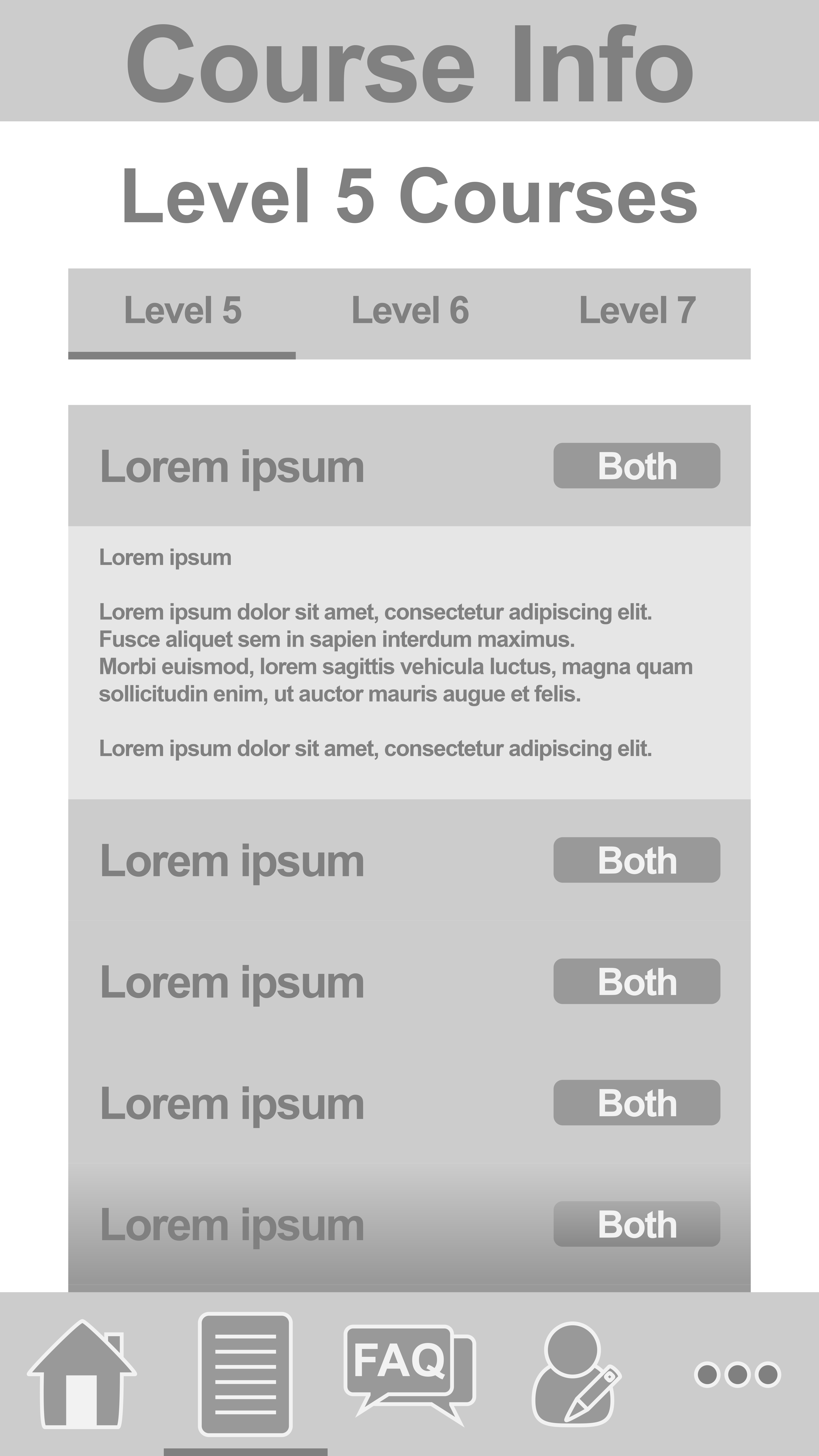
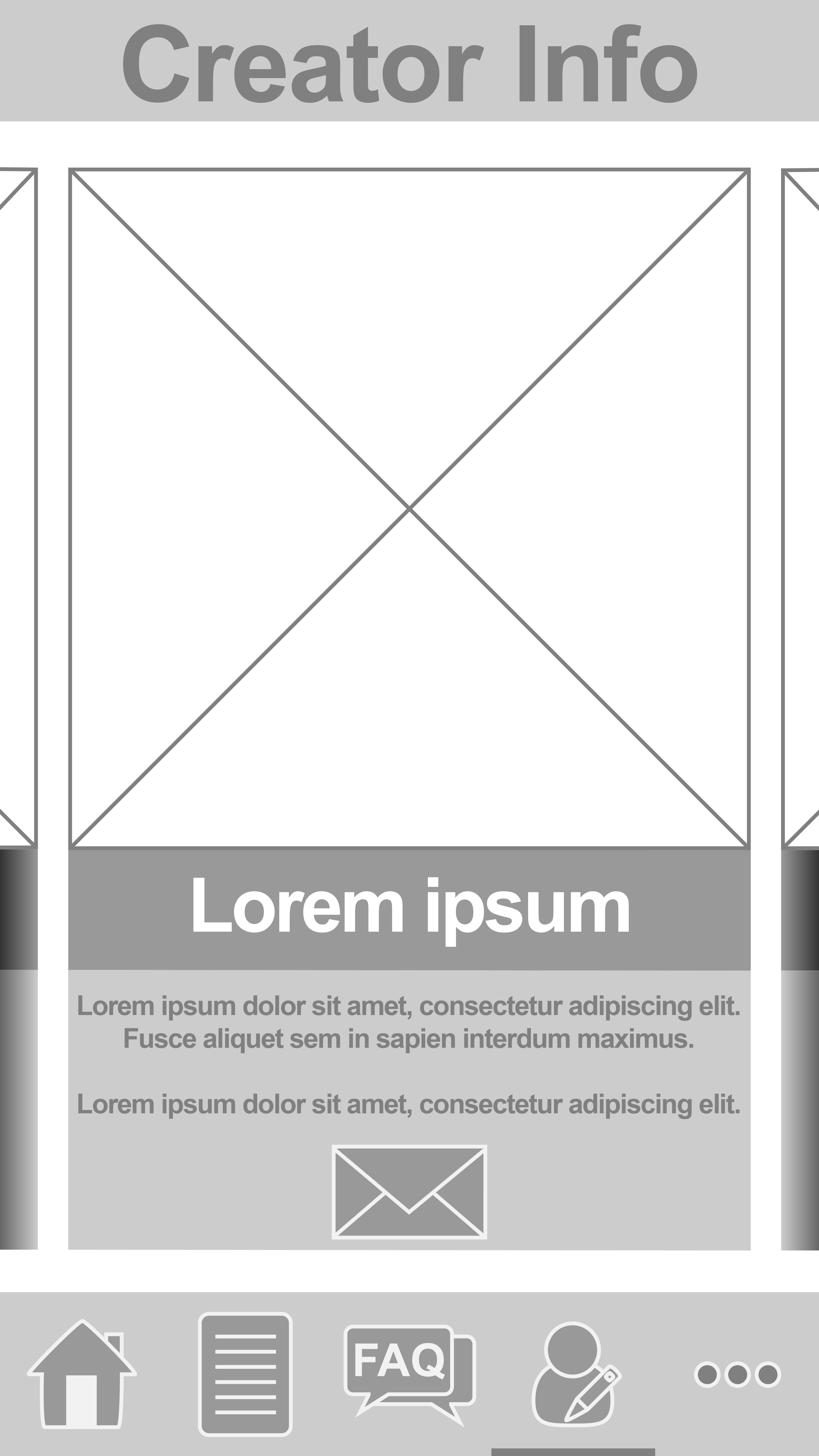
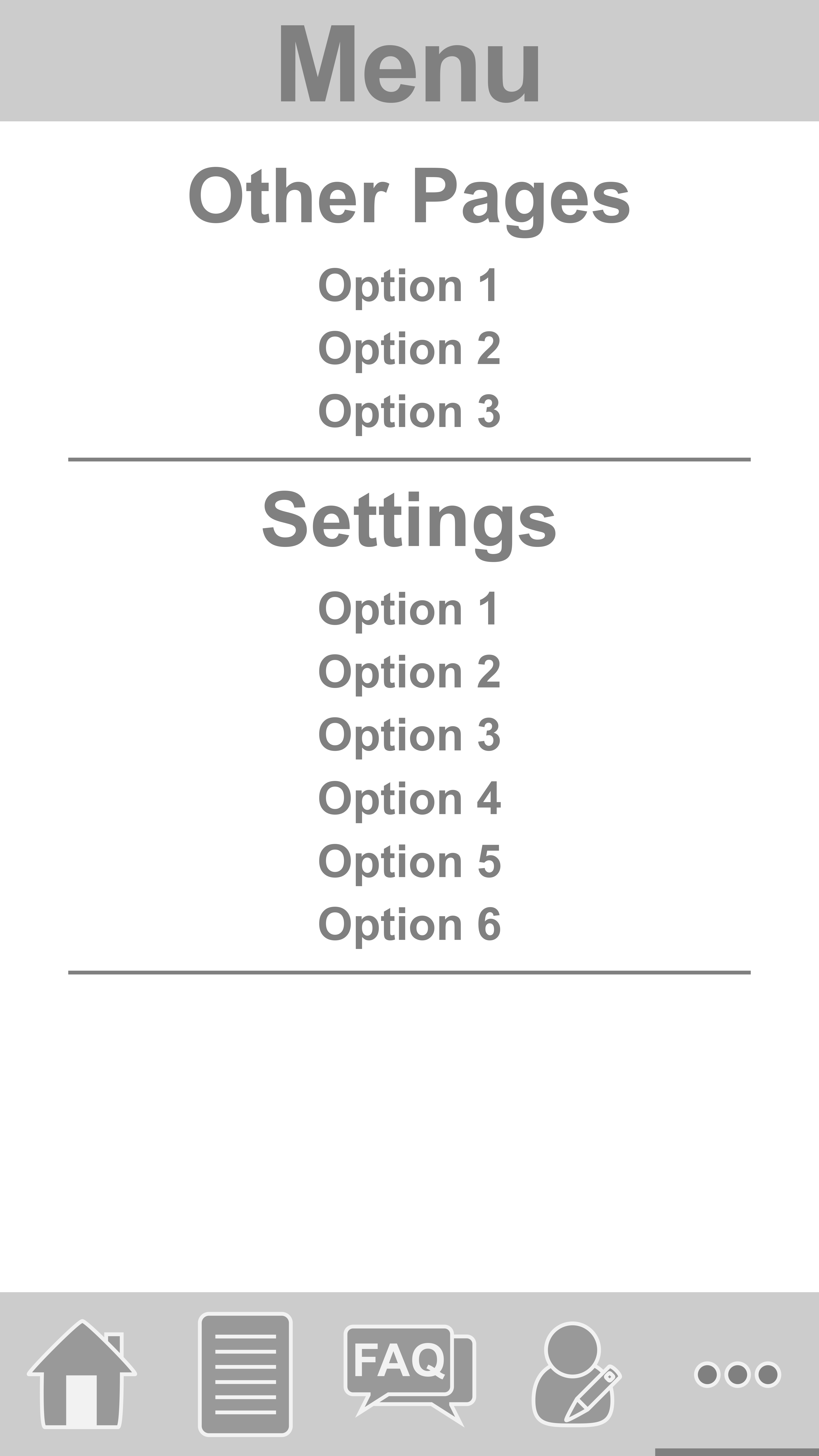
I aimed for a simplistic and modern look, with sharper edges on the buttons and screen elements, which contrast to the icons at the bottom of the phone screen, which appear more rounded than the elements on the page. I did this to make the contents on the page separate from the bottom navigation bar, so that the user can easily distinguish the navigation bar from the content on the page. I used gradients in the home, course info and creator info pages to signify to the user that there is more info on the page than what is currently displayed.
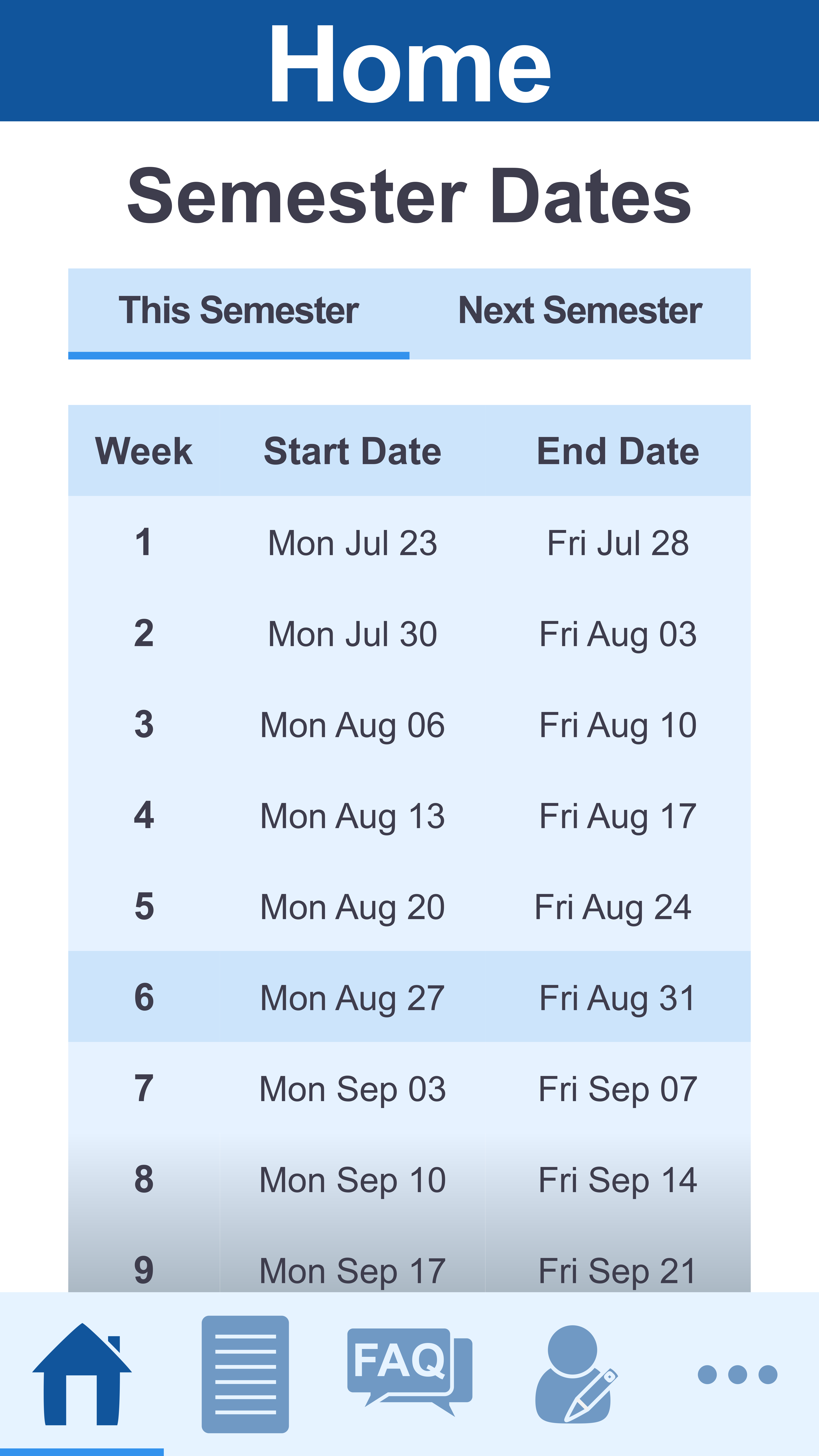

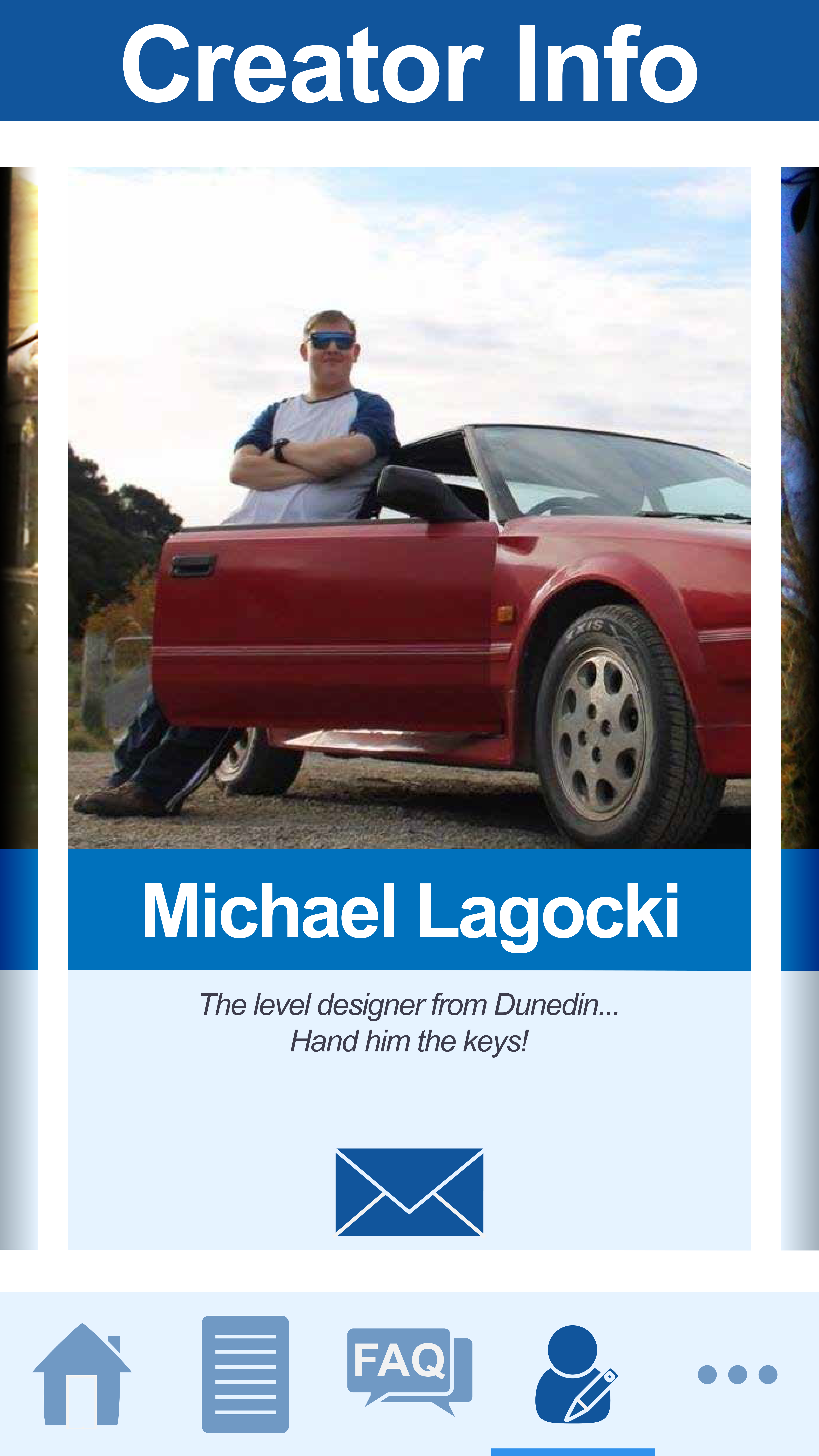
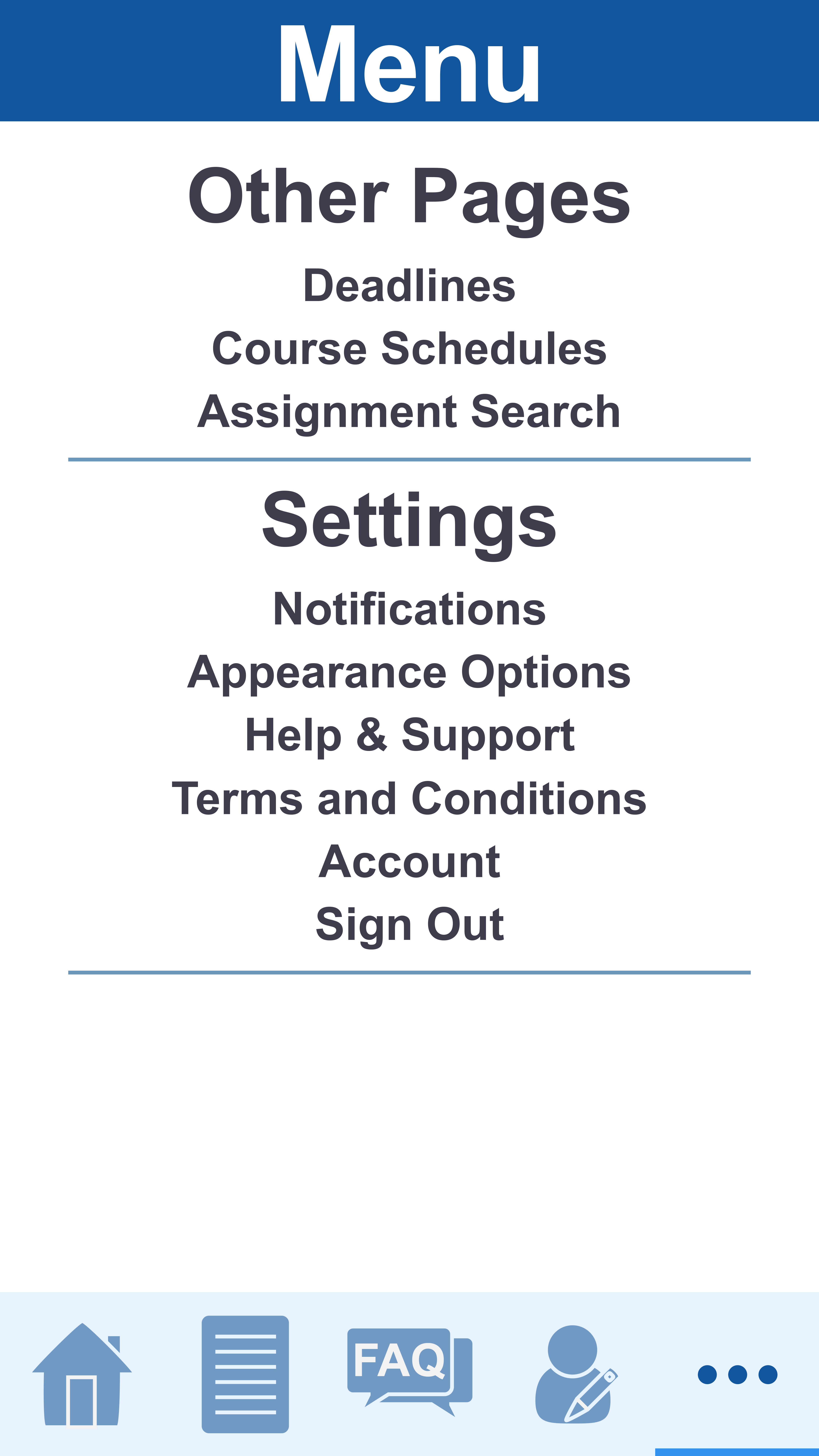
I wanted to keep some space around the elements on all the pages so that it didn’t feel too cluttered and overwhelm the user. For the spacing, I decided to keep spacing to either 40px or 60px where it seemed appropriate, for example, elements which didn’t relate to each other at all had a spacing of 60px, elements which were related (for example the subtitle of the page, and the button group) had a spacing of 40px. Any elements which were grouped to each other, such as button groups or tables, had no spacing in them.
I also used repetition on different pages with the elements, so that the user knew that the information was related to each other. I made it so when the style differed it was to signify to the user that it doesn’t relate to the other information. An example of this is the Course Information and Home page with the Semester Dates, where those two pages are very similar, however, the Creator information differs to those two pages, as the Creator Information does not relate to the Polytechnic.
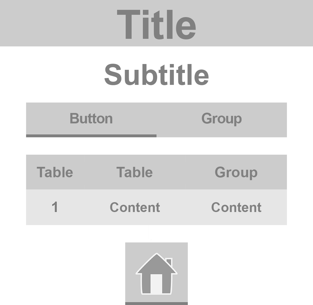
For font colours, I originally went for black for most of the text on the screen but noticed that the colour was too imposing for the style I was going for, so I changed the colour to a dark muted blue, which wasn’t so sharp against the background.